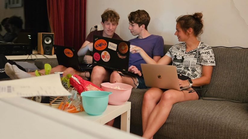
The ‘WebCo’ committee is beaming with pride as they unveil their newly customized website design. After months of dedicated effort and creative thinking, the talented members of WebCo have crafted a fresh and engaging online experience for visitors to their platform.
With a keen eye for detail and a deep understanding of user experience, the WebCo committee has carefully scrutinized every aspect of the website design. From layout and color palette to navigation structure, each element has been thoughtfully chosen to create a cohesive and inviting atmosphere.
A standout feature of the new design is the intuitive navigation, allowing visitors to seamlessly navigate through the different sections of the website. The clear and streamlined layout ensures an optimal user experience, regardless of the device used to access the website.
The color palette, expertly curated by the skilled graphic designers within the committee, reflects the organization’s mission and values. Vibrant hues are combined with subtle shades to create a harmonious whole that is visually appealing while maintaining a professional appearance.
User feedback is highly valued by the WebCo members, which is why they’ve also incorporated interactive elements and streamlined communication channels. Users can now easily share their thoughts, ask questions, and engage with the community through the revamped website.
The ‘WebCo’ committee looks back with pride on their work and is excited about the impact the redesigned website will have on the user experience. With an excellent blend of aesthetics and functionality, they’ve created an online platform that reflects the organization’s identity while also attracting and engaging visitors.
Visitors are warmly invited to explore the new website and enjoy the enhanced user experience that the ‘WebCo’ committee has lovingly designed.


